Presentation Bar Charts
Create 16:9 charts for sales updates, status meetings, market comparisons, and quarterly summaries.
Free Bar Chart Maker
Your bar chart is generated locally in your browser. No database, analytics account, or external data connection is required. This Bar Chart Maker also works as a Column Chart Maker, Horizontal Bar Chart Maker, Comparison Chart Maker, and Simple Bar Graph Maker for comparing categories, products, scores, budgets, votes, surveys, sales, and content results.
Built for slides, class projects, reports, blog graphics, and quick data comparisons.
Manually enter category names and values or paste CSV/spreadsheet rows, choose vertical, horizontal, grouped, or stacked bars, review labels, axes, legend, sorting, highest-value highlighting, and a data summary, then export PNG, SVG, CSV, or editable JSON.
The Bar Chart Maker is designed around one clear search intent: compare multiple category values with a readable bar chart, column chart, horizontal bar chart, grouped chart, or simple bar graph.
Copy rows from Excel, Google Sheets, CSV, TSV, or type a simple Category | Value table. The Bar Chart Maker detects headers, categories, and numeric series, then warns about blank cells, non-numeric values, and duplicate category names.
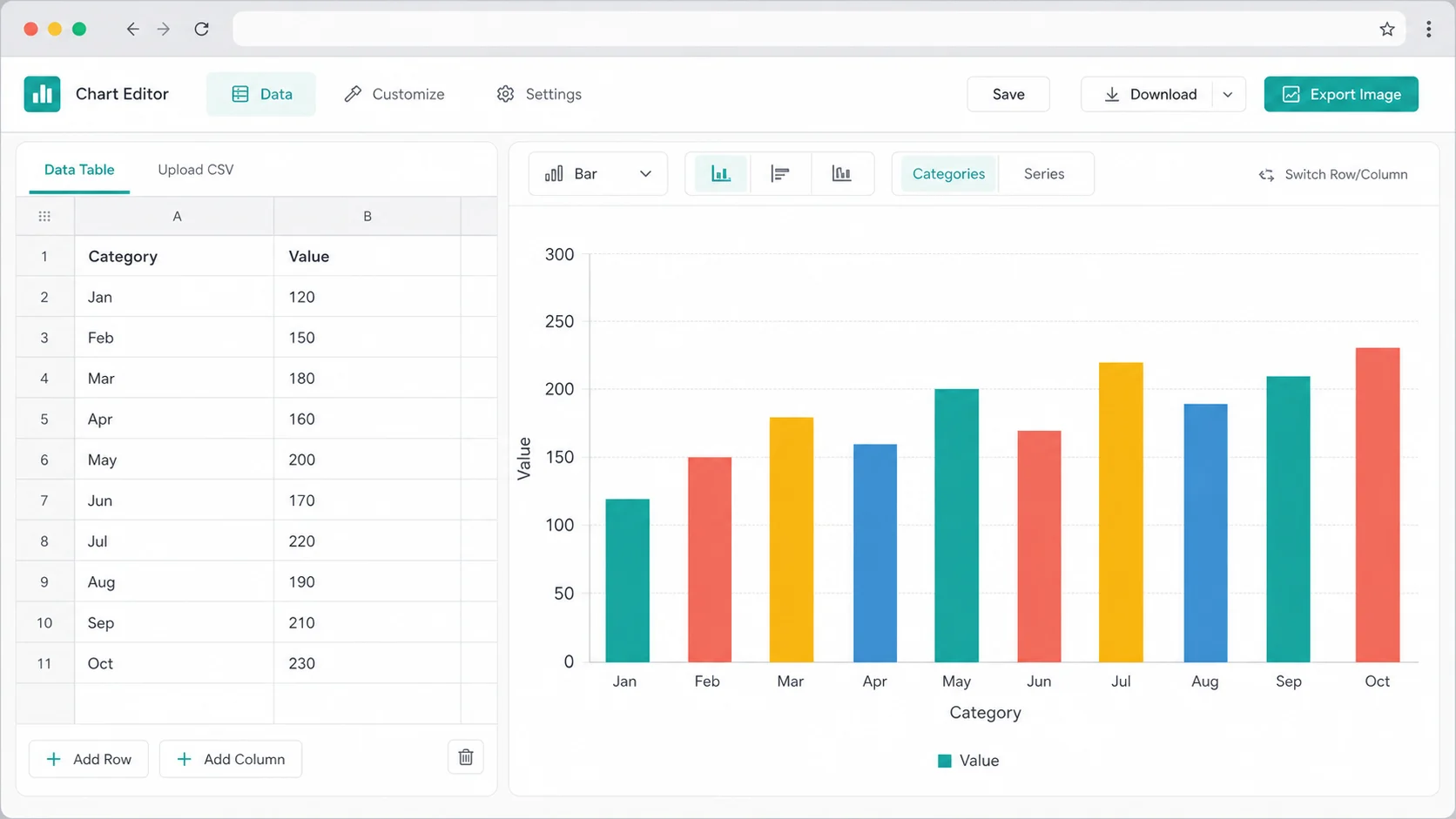
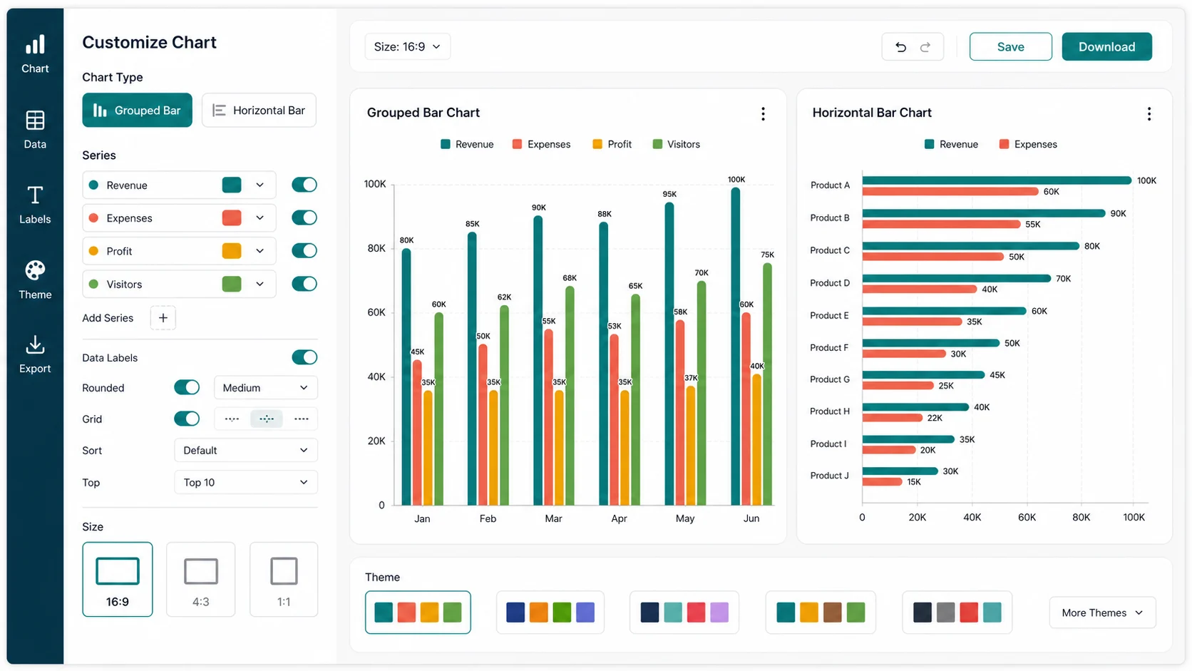
Switch between vertical columns, horizontal bars, grouped bars, and stacked bars in the same Bar Chart Maker. You also get sorting, Top 5 and Top 10 filters, Other grouping, data labels, axis labels, legends, number formatting, highest-value highlighting, themes, and per-bar colors.
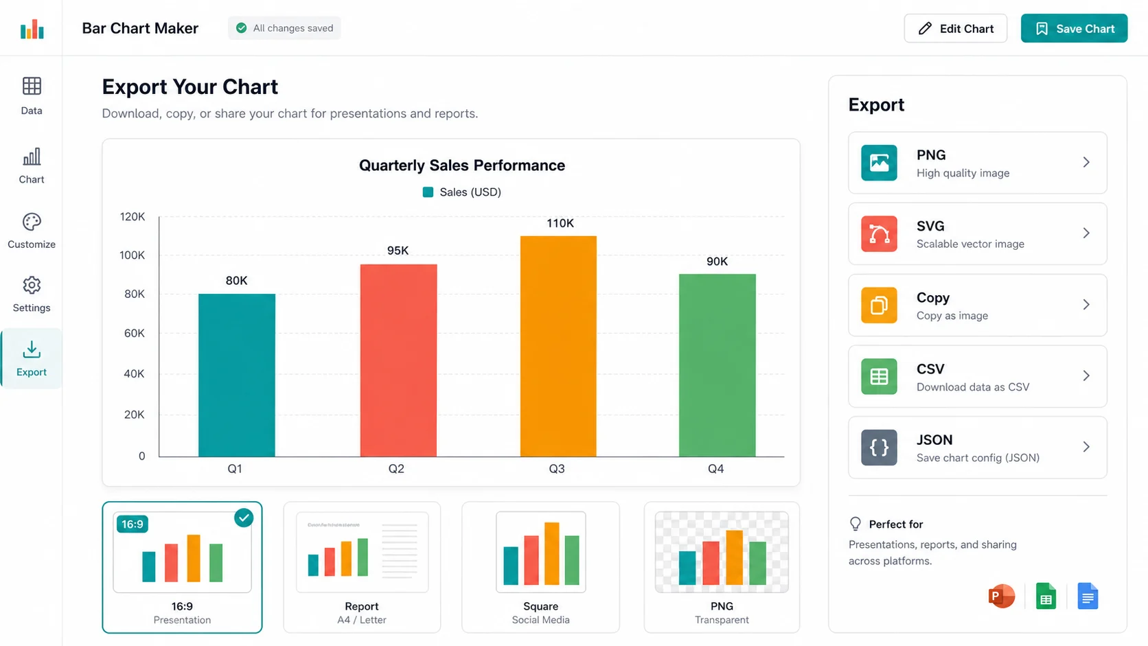
Create files for slides, reports, documents, blogs, social posts, and print. The Bar Chart Maker downloads PNG, SVG, cleaned CSV data, or a JSON config you can import later.
Use one Bar Chart Maker page for column charts, horizontal bar charts, comparison charts, and simple bar graphs instead of splitting the same category-comparison workflow across smaller tools.
Create 16:9 charts for sales updates, status meetings, market comparisons, and quarterly summaries.
Prepare clean bar charts for reports and documents with titles, subtitles, axis labels, source notes, data labels, and print-friendly colors.
Students can paste class data, survey responses, scores, expenses, or population values and export images for assignments.
Compare multiple series across the same categories, such as revenue versus profit, channels by month, or student scores by subject.
Sort values from high to low, keep the Top 5 or Top 10, and merge smaller categories into Other so the output stays readable.
The Bar Chart Maker does not connect to databases, team workspaces, live APIs, ad accounts, analytics platforms, or BI dashboards. Your pasted chart data stays in your browser.
Use this Bar Chart Maker when you need a quick category comparison, not a live business report, database connector, automatic data scraper, ad analytics tool, financial forecasting model, statistical modeling app, or BI dashboard.
Paste two columns for a simple Bar Chart Maker chart, or paste one category column plus multiple numeric columns for grouped or stacked bars. Keep one header row when possible so the editor can name the legend.
Sort by value, keep Top 5 or Top 10, merge the rest into Other, then edit titles, axis labels, legend, data labels, number formats, colors, spacing, background, and the highest-value highlight.
Choose a presentation, report, blog, square, transparent PNG, or print-friendly size. Download PNG for slides, SVG for scalable graphics, CSV for the cleaned data table summary, or JSON to edit the chart later.
The editor saves locally in your browser and does not upload chart data to a server.
Answers to practical questions about data input, privacy, exports, chart types, and tool limits.
Yes. This Bar Chart Maker keeps column charts, horizontal bar charts, grouped bar charts, comparison charts, and simple bar graphs on one page because they all solve the same task: comparing category names and numeric values.
Yes. Copy cells from Excel or Google Sheets and paste them into the Bar Chart Maker data box. It also accepts manual entry, CSV, TSV, semicolon, and pipe-separated rows.
The editor supports vertical, horizontal, grouped, and stacked bar charts. Use vertical bars for short labels, horizontal bars for long labels, grouped bars for side-by-side series, and stacked bars for totals by category.
It detects a header row, finds category and numeric columns, treats empty or invalid numeric values as 0, combines duplicate category names, sorts values, keeps Top 5 or Top 10, and can merge the rest into Other.
Yes. You can edit the chart title, subtitle, X-axis label, Y-axis label, legend, data labels, source note, decimals, thousands separators, percent format, currency prefixes, and custom unit suffixes.
Yes. Choose the transparent PNG size preset or set the background to transparent, then download PNG. You can also export SVG when you need scalable chart artwork.
Yes. The Bar Chart Maker runs in your browser. It does not upload your pasted data, connect to an online database, create team projects, use an analytics account, or require an account.
It is not a database connector, real-time business reporting tool, automatic data scraping tool, ad analytics dashboard, financial forecasting tool, statistical modeling app, or BI dashboard. Those workflows need backend databases, third-party APIs, or complex data processing.
Yes. Exported charts are yours to use in reports, business presentations, school projects, websites, print material, and social posts.
Use a bar chart when you want to compare categories or rankings. Use a pie chart only for a small part-to-whole breakdown, and use a line chart when the trend over time matters more than category comparison.
Paste or manually enter your table data, choose the chart type, clean the rows, and export a polished PNG, SVG, or CSV in minutes.
No account, no cloud upload, no database connection - just a focused chart editor for quick visual comparisons.
Free forever. Your bar chart data stays local in your browser.